Did you know that color can increase brand recognition by up to 80%?
In the world of UI design, color isn't just about aesthetics; it's a powerful tool that influences user behavior, emotion, and overall experience.
Ever wondered why so many social media apps use blue? Or why e-commerce sites often use green for 'Buy Now' buttons? There's a science behind it.
In this guide, we'll explore the fundamentals of color theory, practical tips for choosing color palettes, tools to help you, and examples of effective color usage in UI design.
The Basics of Color Theory
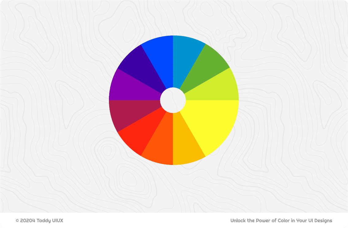
Color wheel
We all likely have some familiarity with the color wheel – that circular diagram showing the relationships between colors. In its traditional form (RYB - Red, Yellow, Blue), it's based on how pigments mix. You'll remember the basics:
Primary Colors (RYB): Red, Yellow, Blue – the foundational colors.
Secondary Colors: Green, Orange, Purple – created by mixing two primaries.
Tertiary Colors: Colors like Red-Orange, Yellow-Green – created by mixing a primary and a neighboring secondary.
In the digital world, where we design UIs, we work with the RGB (Red, Green, Blue) color model. This is an additive model, where colors are created by combining light. The primaries are different (Red, Green, Blue), and the secondaries are Cyan, Magenta, and Yellow. Combining all RGB primaries at full intensity creates white.
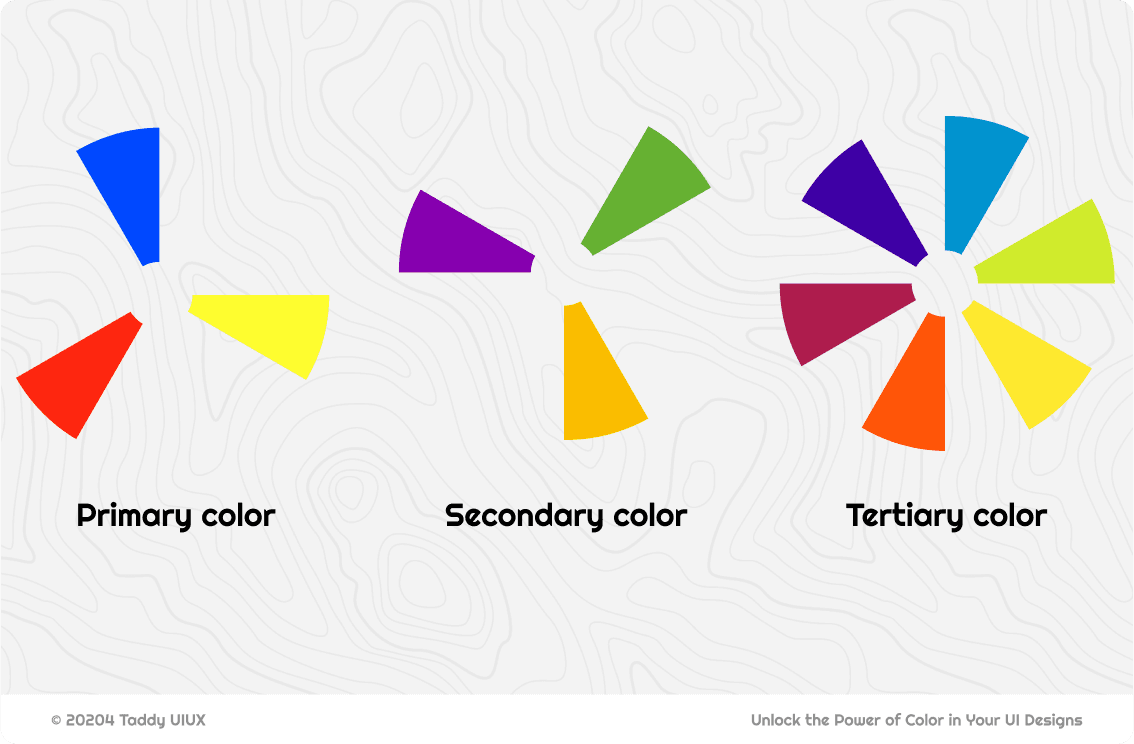
But for UI design, it's not enough to just memorize these categories or the specific primaries of each model. The relationships between colors on the wheel – how they interact visually – are far more important. This is where the true power of the color wheel lies for creating effective and visually appealing interfaces.
Understanding these relationships allows you to move beyond simply picking colors you "like" and instead make strategic color choices that support your design goals. This concept of color relationships leads us directly to color harmonies.
Key Color Harmonies
Color harmonies are specific combinations of colors, derived from their positions on the color wheel, that are considered visually pleasing and balanced. Think of them as tried-and-true recipes for creating color palettes. Understanding these harmonies is a shortcut to making good color choices in your UI.
A. Complementary:
Colors that are directly opposite each other on the color wheel (e.g., Blue and Orange, Red and Green, Yellow and Purple). This creates high contrast.
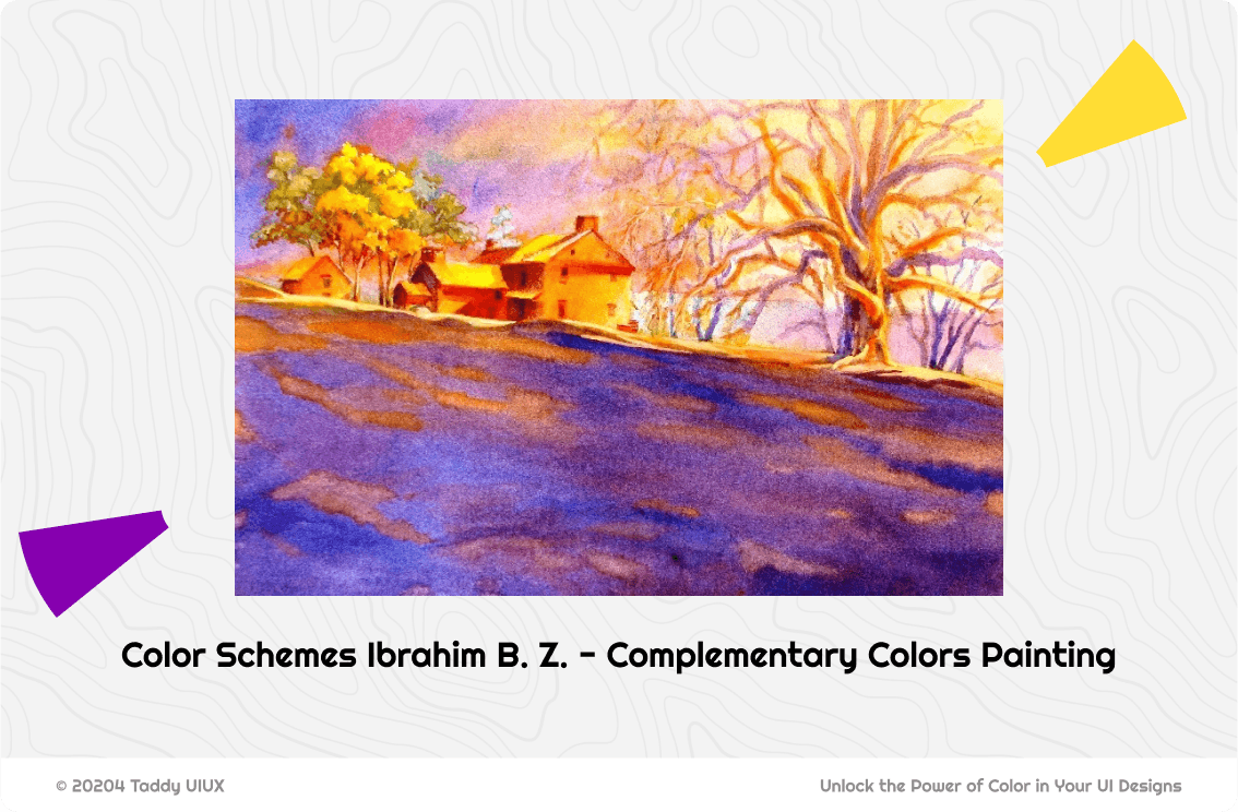
This painting beautifully demonstrates the power of complementary colors. The artist has used a predominantly purple and yellow palette, creating a striking visual contrast. Notice how the yellow accents (the house, parts of the trees) immediately draw the eye against the purple background.
Complementary colors excel at drawing attention to key UI elements. Use them for call-to-action buttons, important notifications, or interactive elements – the high contrast will make them instantly noticeable.
However, avoid using complementary schemes for large areas like backgrounds, as the intense contrast can cause visual fatigue. Instead, choose one color as dominant (often a less saturated version) and use its complement as an accent.
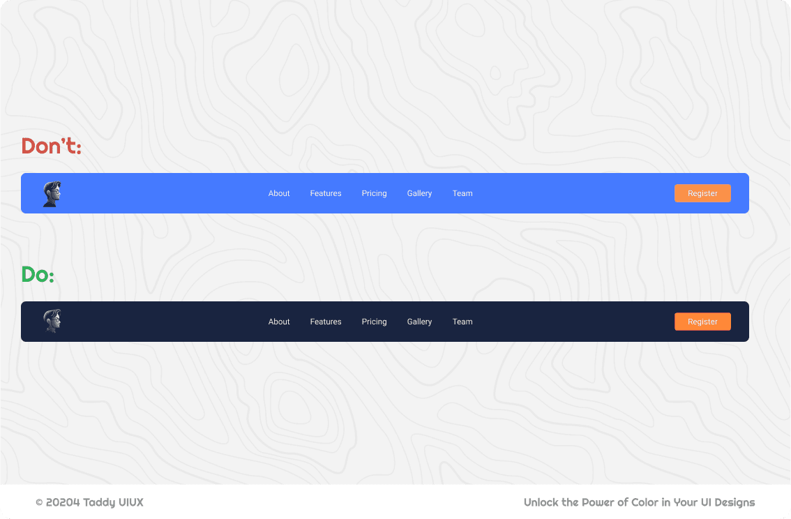
Note that you should not simply choose any two complementary colors and expect them to work. The top example demonstrates how complements with similar value can clash, creating a visually uncomfortable 'vibration'. The colors compete for attention, making the text hard to read. The bottom example corrects this by using a much darker blue, providing strong value contrast against the orange and improving readability.
B. Analogous:
Colors that are next to each other on the color wheel (e.g., Blue, Blue-Green, Green). This creates a harmonious and calming effect, suitable for overall UI schemes where you want a sense of unity.
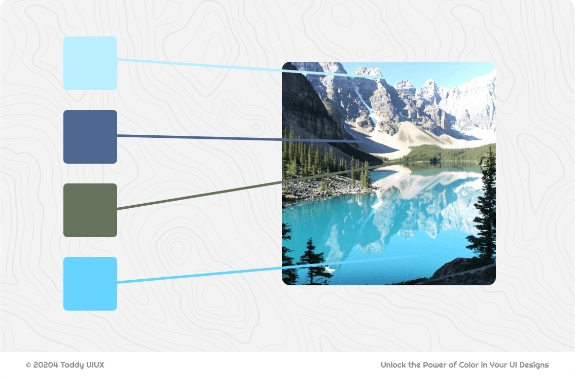
Nature is a masterclass in color harmony. This photograph is a prime example of an analogous color scheme in action. Notice how the colors flow seamlessly from the vibrant turquoise of the lake to the deeper blues of the distant mountains and the greens of the surrounding forest. These colors are adjacent to each other on the color wheel, creating a sense of tranquility and visual unity.
Analogous colors create harmonious and calming UI designs. Use them for overall themes, backgrounds, and related elements where visual unity is desired. Avoid stark contrasts within the analogous range; aim for smooth transitions.
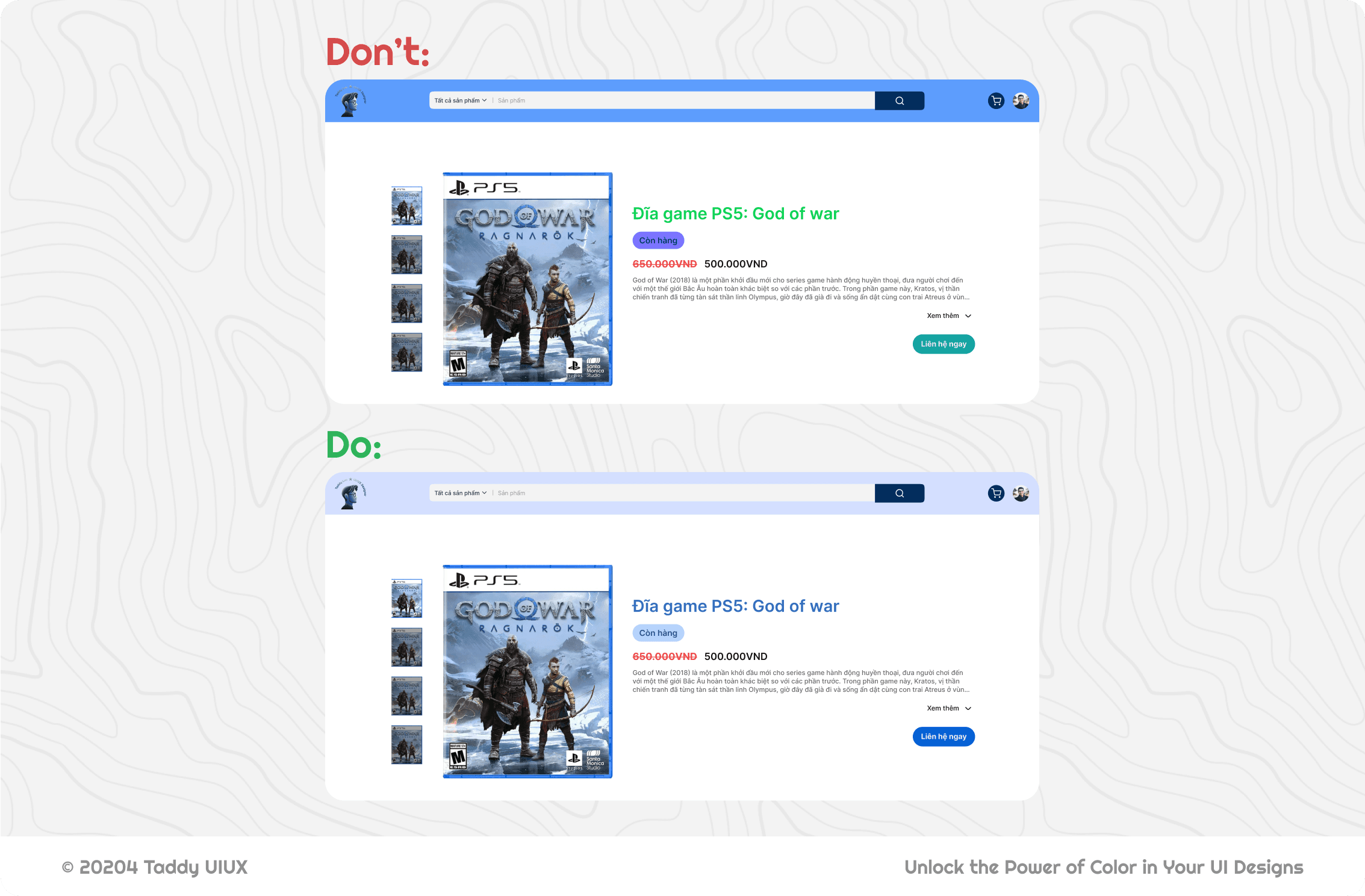
The top UI's color choices violate the principles of a well-executed analogous scheme. The varying blues lack a consistent hue relationship, and the medium-light blue-gray used for the price has insufficient luminance contrast against the background. The bottom example rectifies this by employing a darker, desaturated blue, ensuring adequate contrast and creating a more unified aesthetic.
C. Triadic:
Three colors evenly spaced on the color wheel (e.g., Red, Yellow, Blue). This offers a vibrant and balanced palette, but it requires careful use to avoid overwhelming the user. One color should usually dominate, with the others used as accents.
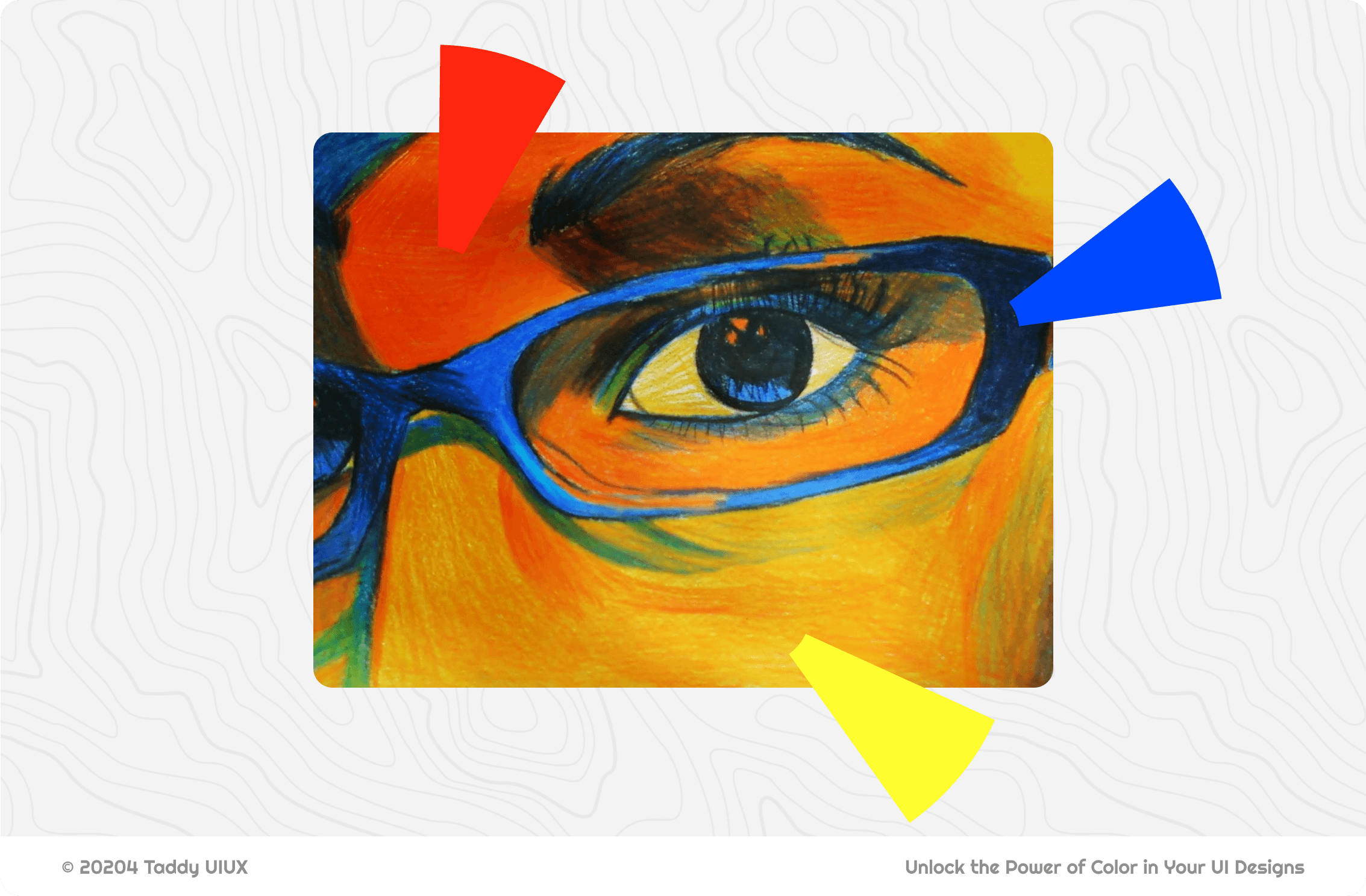
This painting is a fantastic example of a triadic color scheme in action. Notice the dynamic interplay between the red-violet, yellow-orange, and blue-green. It's vibrant, but it's not chaotic. This balance is the key to using triadic colors effectively.
You can translate this directly to your UI design: choose three evenly spaced colors on the wheel, establish a dominant hue, and use the others as accents for a lively yet controlled interface. Think a muted red-violet background with pops of yellow-orange for buttons and blue-green for secondary elements.
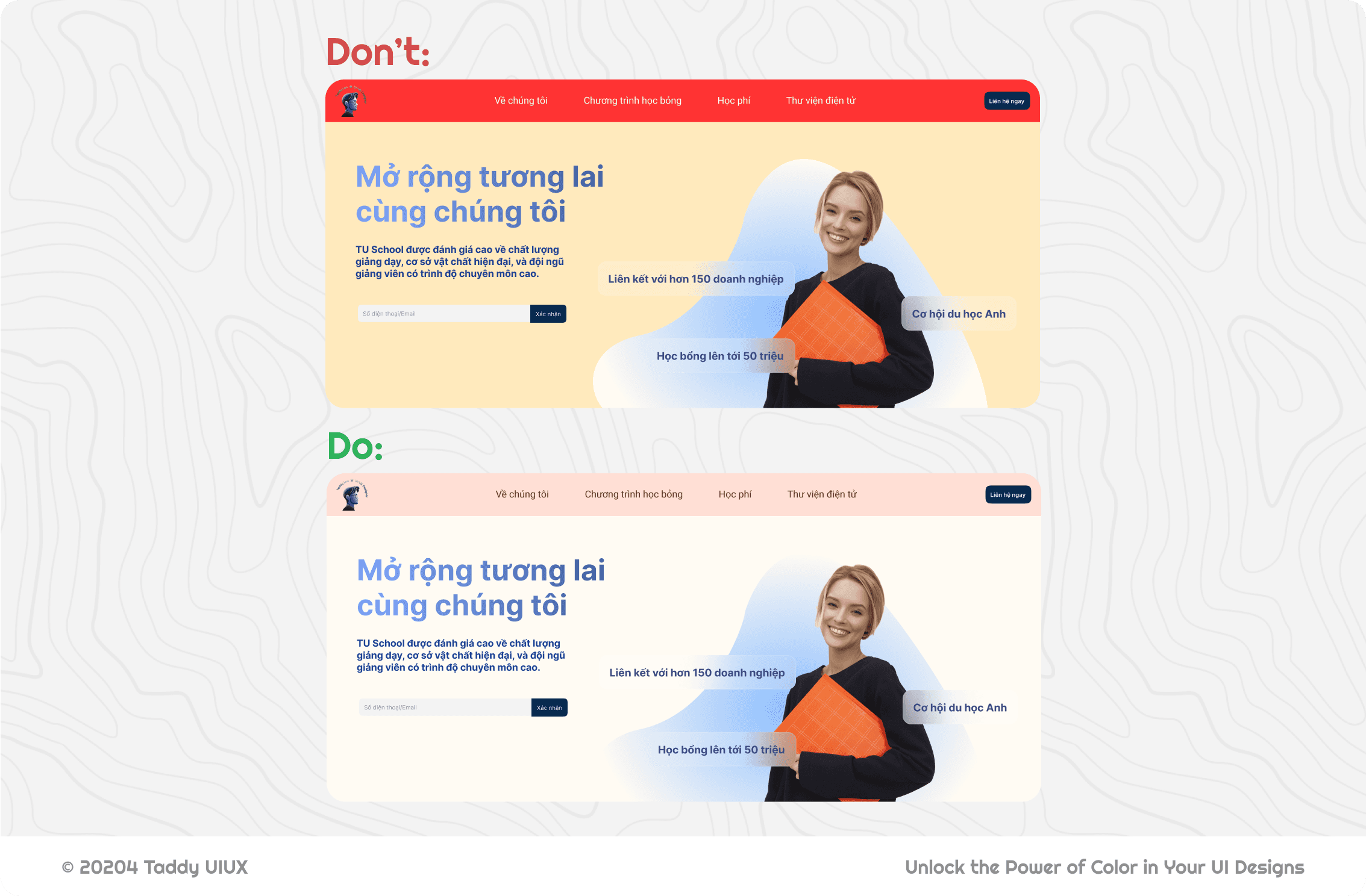
The "Don't" example misuses the triadic scheme (red, yellow, blue) by making the red header overwhelmingly dominant, creating a visual clash with the blue elements and poor contrast with the white text.
The "Do" example demonstrates a correct application of the triadic scheme. It uses a tint of yellow for the background, providing a soft, neutral base. Blue is used effectively for text and calls to action, offering good contrast. Crucially, it softens the red to a peach/salmon tint for the header, reducing its intensity and creating better harmony with the other two colors while still maintaining the red's presence in the triad.
Note: To use triadic colors well, establish a clear hierarchy. Let one color (often a tint) dominate the background, use a second for key interactive elements, and the third – often the strongest – sparingly and strategically for emphasis. Don't be afraid to use tints (color + white) and shades (color + black) to adjust the intensity of your triadic colors, creating better contrast, readability, and overall visual balance. The key is to create a harmonious relationship, not just to pick three equidistant colors on the wheel.
D. Monochromatic:
Using variations of a single hue (different shades, tints, and tones). This creates a sophisticated and clean look, often used in minimalist designs. It's inherently unified and easy on the eyes.
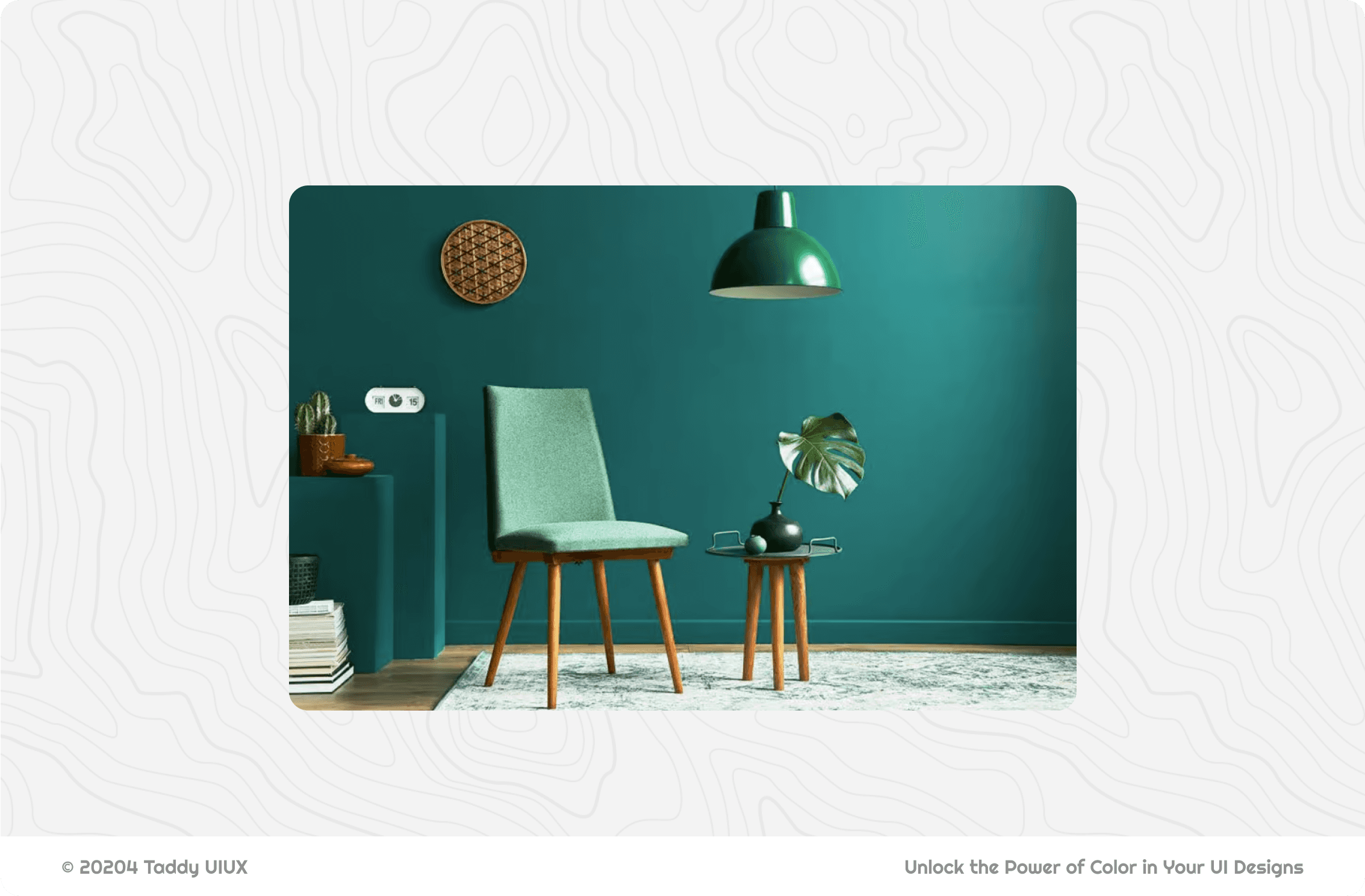
Monochromatic color schemes seem simple, and they can be easy to use, but don't fall into the trap of making them dull! The biggest mistake is sacrificing contrast for the sake of using a single hue.
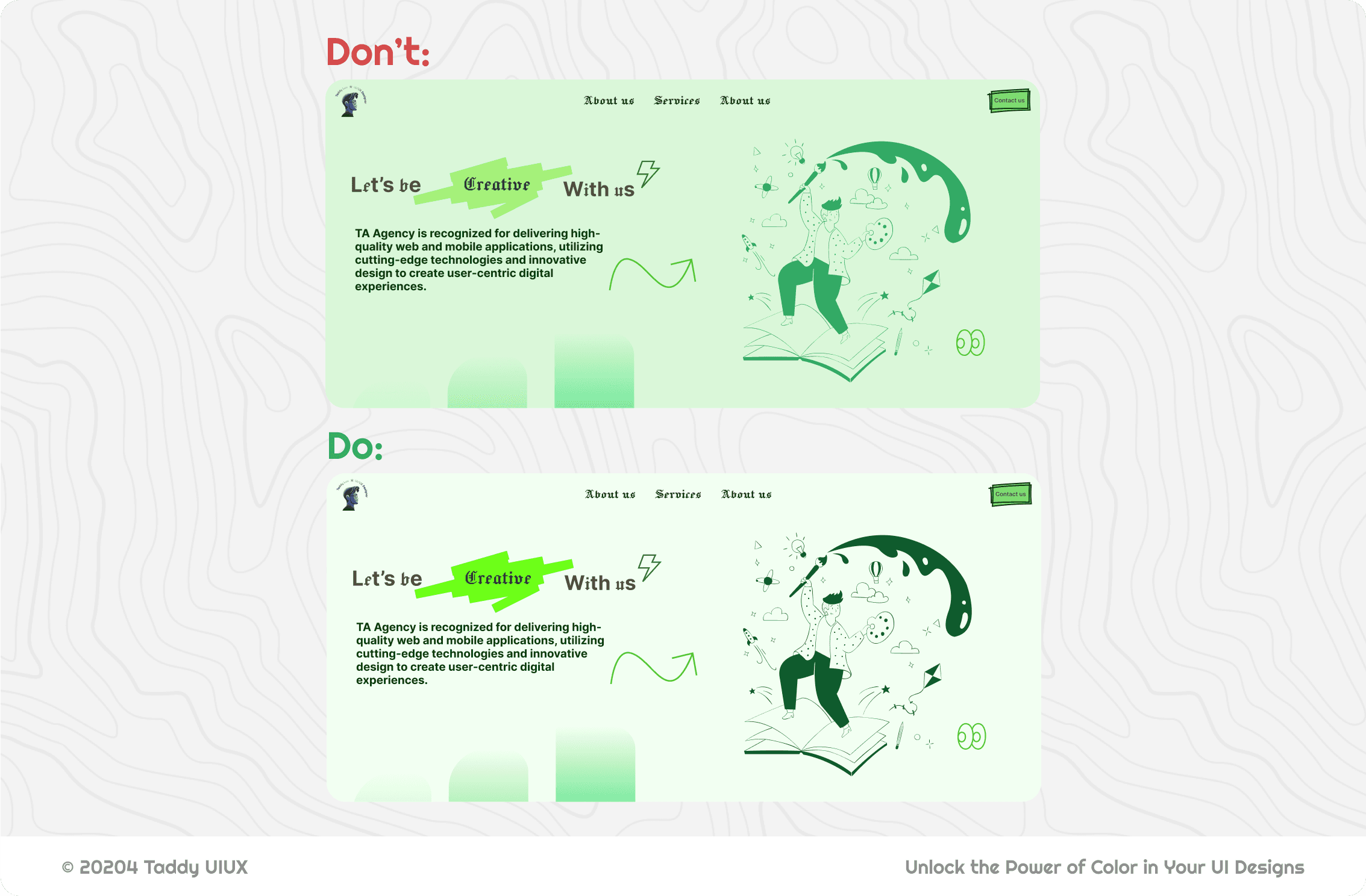
While you're sticking to variations of one color, make absolutely sure that text, buttons, and important elements stand out clearly against their backgrounds. Poor contrast defeats the purpose, creating a visually unappealing and inaccessible design, even if it's technically "monochromatic."
How Colors Communicate: Color Interaction and Perception
Colors are rarely seen in isolation. They are almost always perceived in relation to other colors, and this interaction significantly impacts how we see them. Understanding this is crucial for UI design, as it affects everything from readability to visual hierarchy.
A. Hue contrast:
Have you ever noticed how a color can seem to change depending on what's next to it? It's not magic.
Before we dive into the illusion, let's quickly recap warm and cool colors. Think of the color wheel:
Warm Colors: Reds, oranges, and yellows. They evoke feelings of sunshine, fire, and energy.
Cool Colors: Blues, greens, and purples. These remind us of water, sky, and calmness.
While red and blue are clearly warm and cool, yellow and purple are mixtures. Yellow (red + green) and purple (red + blue) contain both warm and cool elements. However, because yellow strongly evokes the sun, we generally classify it as warm. Similarly, because purple is often associated with the calmness of twilight or deep water, it's typically considered cool.
This highlights that our perception of color temperature is also influenced by cultural associations and emotional responses, not just pure spectral composition.
Now, let's do a little experiment. Look at these two images below:
Take a close look at the gray squares in each image, the left is inside of a red square and the right is inside of a blue one. Which gray square appears warmer to you? Which one seems cooler?
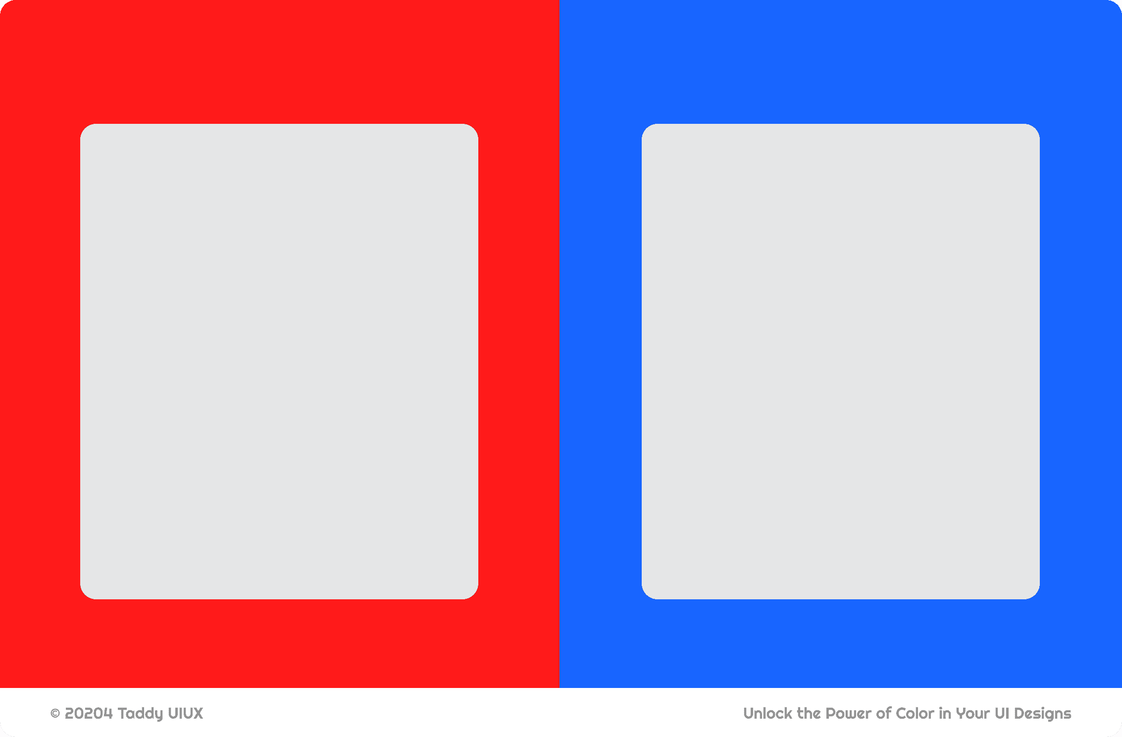
For those who answered it right, congratulation! But for those who didn't get that, don't get dissapointed too early because I got tricked by this a lot. Believe it or not, both gray squares are precisely the same color!
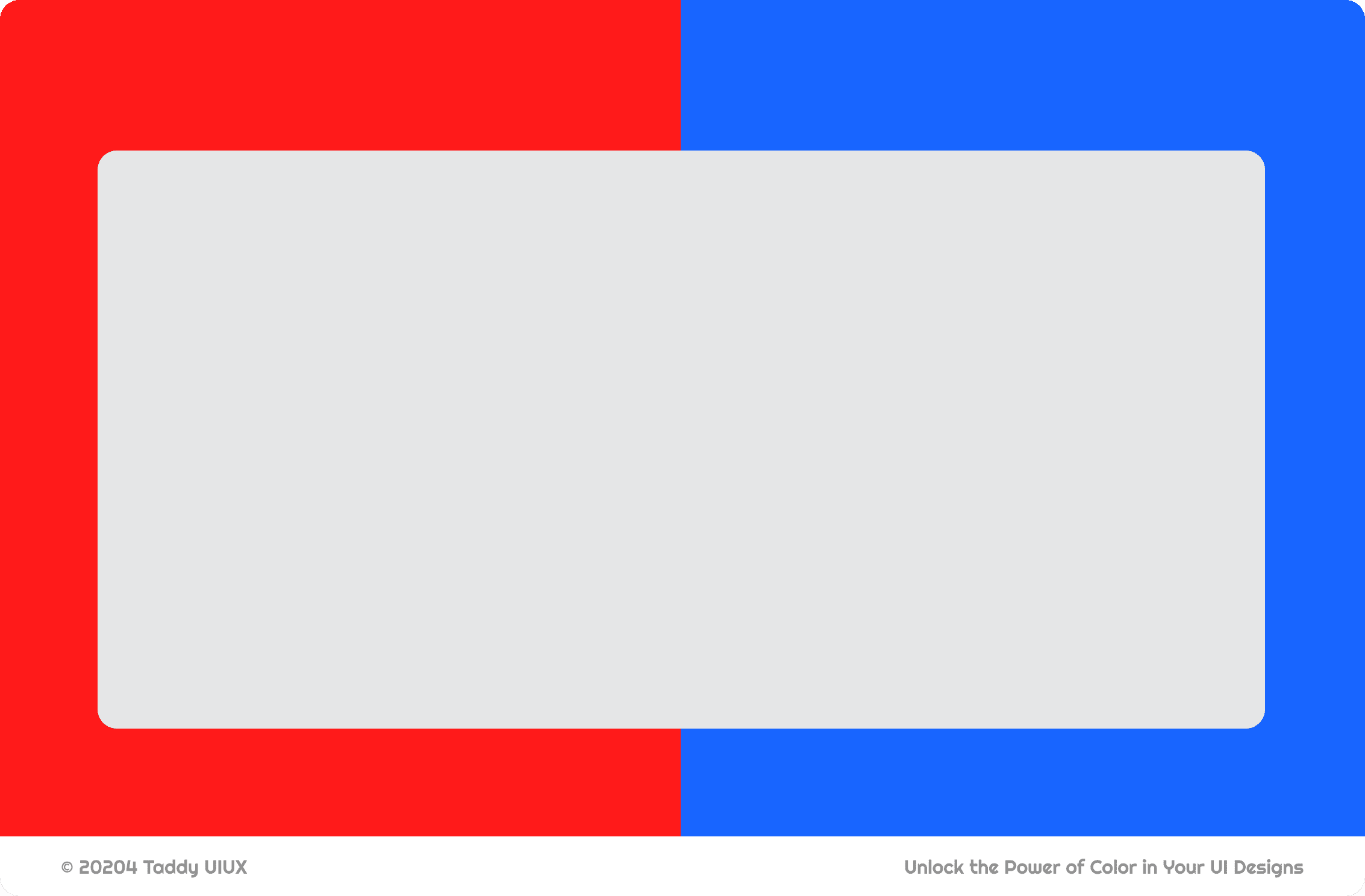
A color will appear to shift away from the hue of its surrounding color. For instance, a gray square will look slightly bluish on a yellow background and slightly yellowish on a blue background.
Our brains are wired to perceive colors in relation to each other. The warm red background "pushes" the gray square to appear cooler (slightly bluish), while the cool blue background "pushes" the gray square to appear warmer (slightly yellowish/reddish).
The key takeaway is this: every color has an element of warmth or coolness, even if it's subtle. And that warmth or coolness becomes more pronounced when it interacts with other colors. Colors don't exist in isolation; they "communicate" with each other, constantly influencing how we perceive them.
B. Value/Brightness Contrast:
Ever struggle with getting the brightness of your colors just right? Do your designs sometimes feel flat, or do your text and background clash in a way that's hard on the eyes? You're not alone! Many designers find it challenging to master value contrast (also known as brightness contrast), but it's absolutely essential for creating readable and visually appealing designs.
The best way to understand value contrast is to see it. Take a look at this example:

Notice how the exact same gray square looks much lighter against the black background and significantly darker against the white background? This dramatic difference in perceived brightness, even though the gray itself hasn't changed, is the essence of value contrast.
That's where the WCAG (Web Content Accessibility Guidelines) come in. These guidelines, developed by the World Wide Web Consortium (W3C), provide specific recommendations for ensuring that web content is accessible to everyone, including people with disabilities.
What WCAG Says: WCAG specifies minimum contrast ratios between text and background. These ratios are based on mathematical formulas that take into account how our eyes perceive contrast.
Why It Matters: Following WCAG guidelines isn't just a "nice to have"; it's often a legal requirement, and more importantly, it's the right thing to do to ensure your designs are inclusive.
C. Saturation Contrast:
Of all the color principles, saturation contrast might be the most "magical." It's the secret weapon designers use to make elements truly pop or subtly fade into the background, all without changing the underlying hue or brightness. Pay close attention, because this is where color gets really interesting!
The best way to grasp this is to see it in action. Look at the example below:
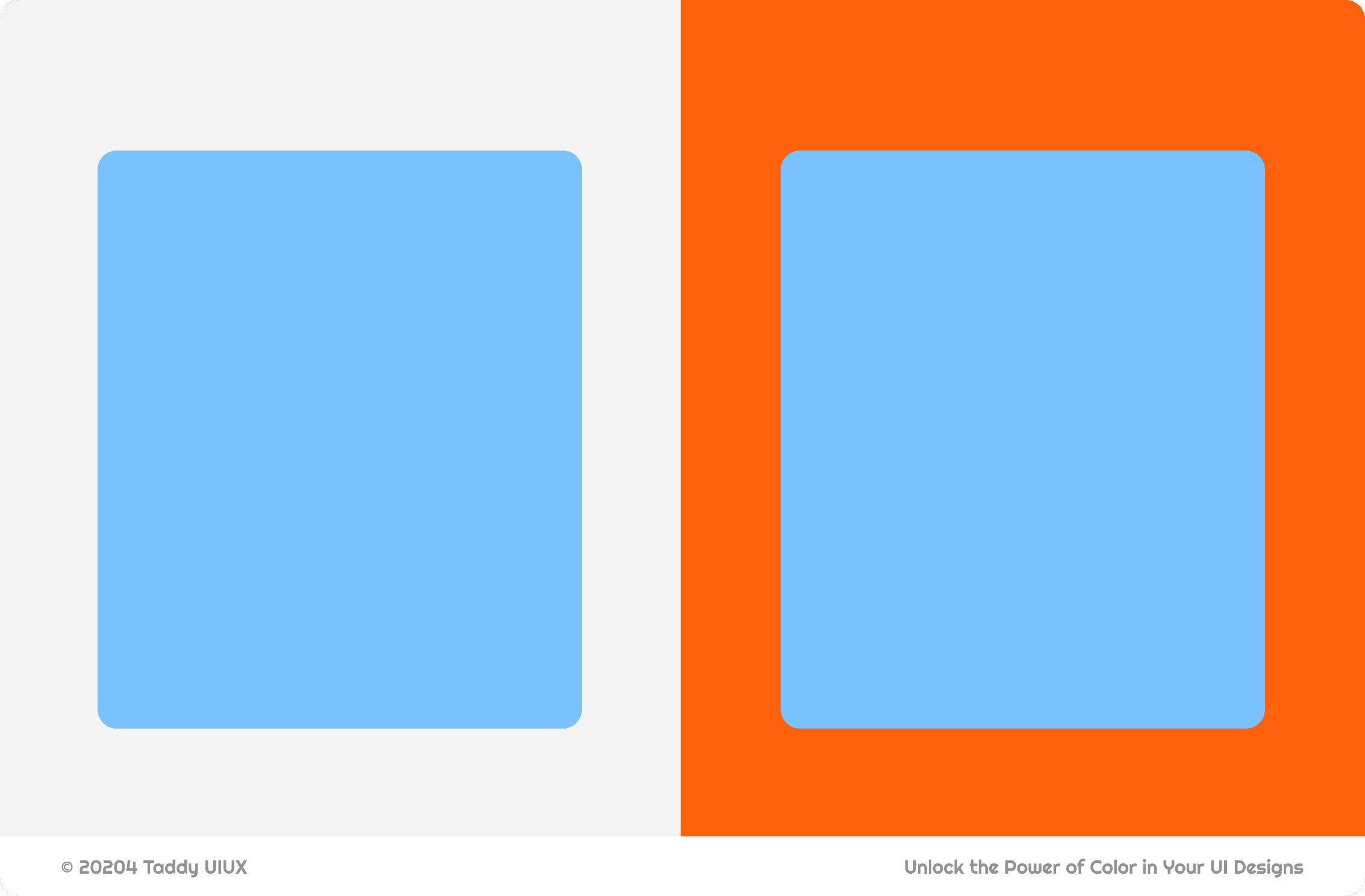
Do you see how the blue square seems to change? It's almost unbelievable, but...I guess I can't do a trick 3 times, both blue squares are exactly the same color! This is the power of saturation contrast. Here's the formal definition:
Saturation Contrast: A color will appear more saturated (intense) when surrounded by less saturated colors and vice versa.
On the gray background (which has very low saturation), the blue square appears relatively vibrant. But against the highly saturated orange, that same blue square suddenly seems much more muted, almost dull in comparison. The orange "steals" the show, making the blue appear less intense.
Color Psychology in UI Design
Color isn't just about aesthetics; it's a powerful psychological tool. The colors you choose for your UI/UX design can significantly impact user perception, emotion, and behavior.
Understanding the basic associations of different colors is crucial for creating designs that resonate with your target audience and achieve your desired goals. Let's explore some common color associations and see how brands leverage them effectively.
A. Red:
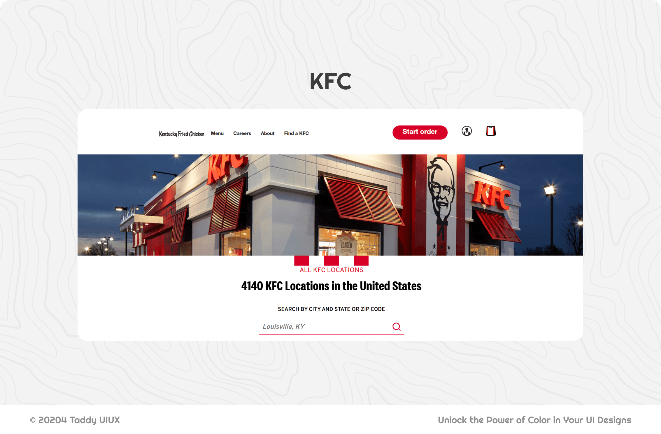
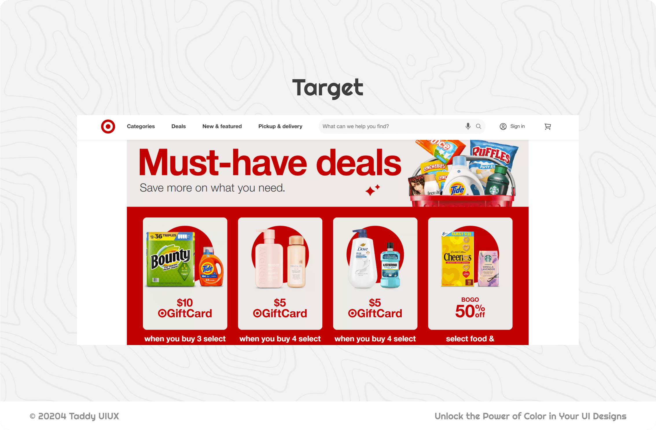
Feeling a sudden urge to act? Red is the color of energy, passion, and urgency – it's a visual shout! Think of the bold red of a Netflix "Play" button, daring you to dive into your next binge, or the warning flash of an error message. That's red in action. It's powerful, but overwhelming if overused.
Fast food giants like McDonald's and KFC use it to stimulate appetite and create a sense of quick, exciting service. Brands that want to be bold and grab attention – like Target – often incorporate red strategically.
B. Blue:
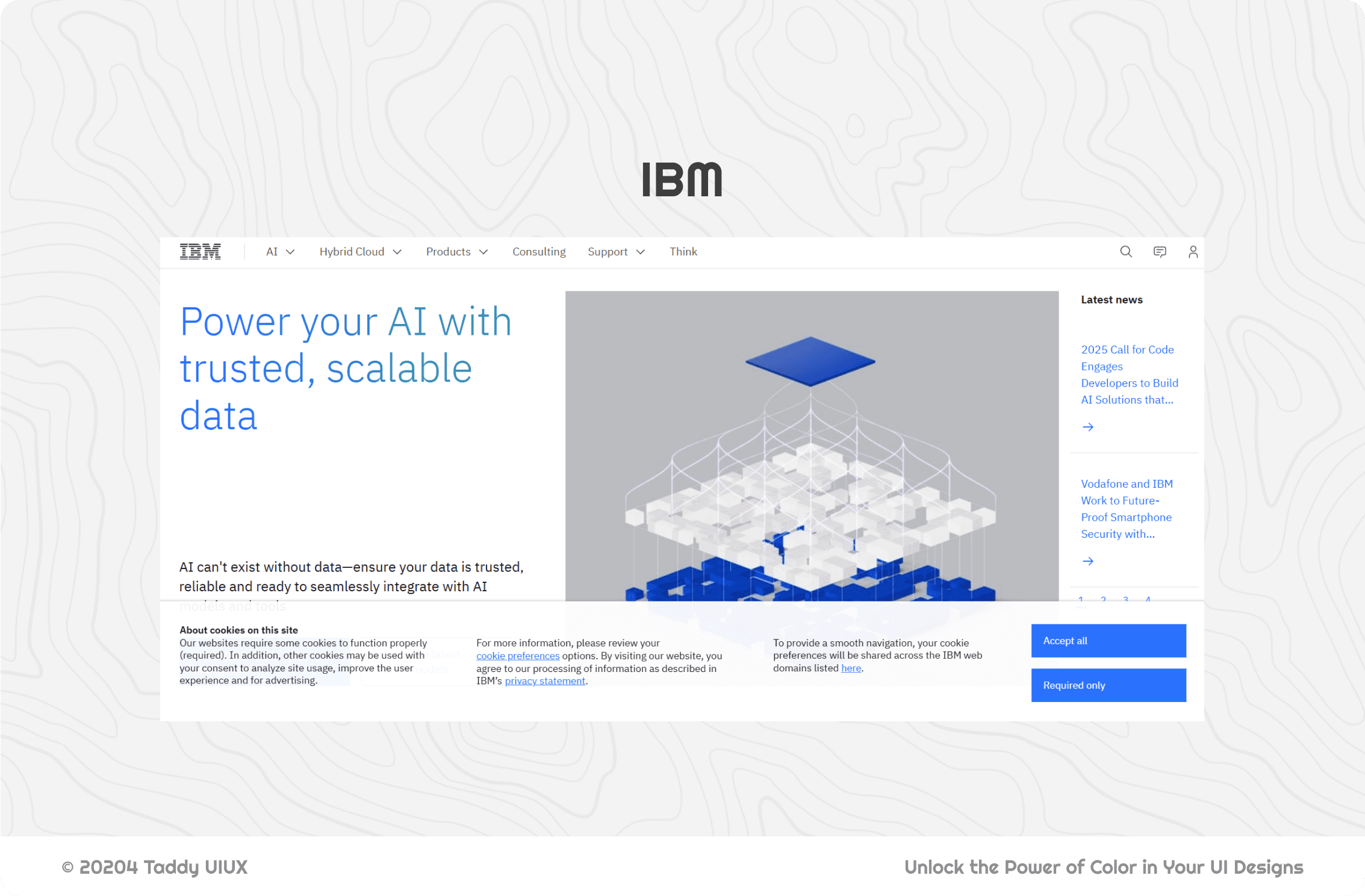
Need to build trust? Blue is your go-to. It whispers calmness, stability, and professionalism – the visual equivalent of a firm handshake. That's why you see so much blue in the corporate and tech worlds.
Companies like Facebook, IBM, and PayPal use blue to convey reliability and security, reassuring users that their data (and money) are in safe hands. It's the color of confident expertise.
However, it's also worth noting that in some cultures, blue can carry connotations of sadness or melancholy. Remember the character Sadness in Pixar's "Inside Out"? Her predominantly blue color palette taps into this association – think of tears, or the phrase "feeling blue." So, while blue is generally a safe and trusted choice, be mindful of your target audience and context. A little cultural awareness goes a long way!
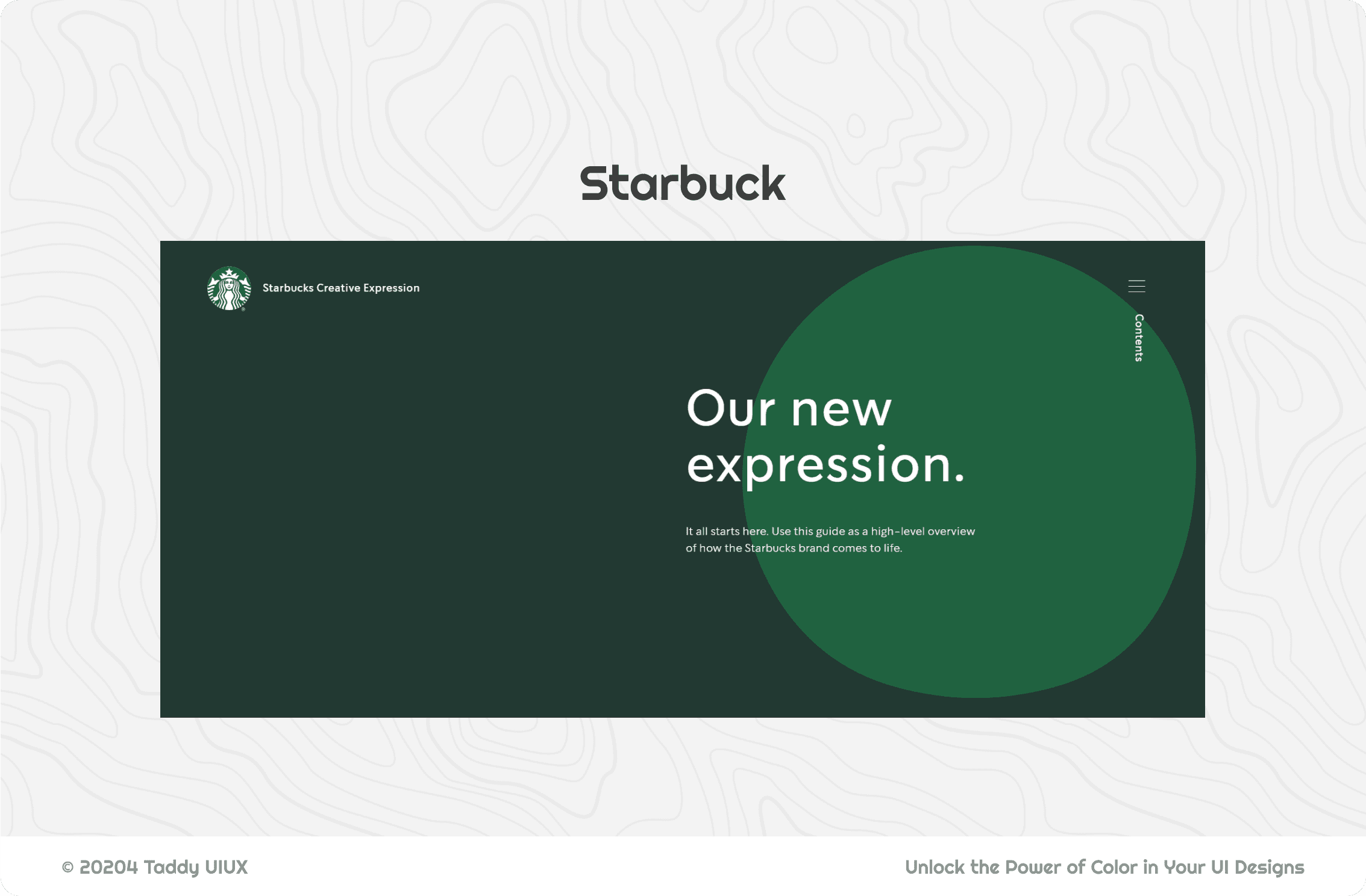
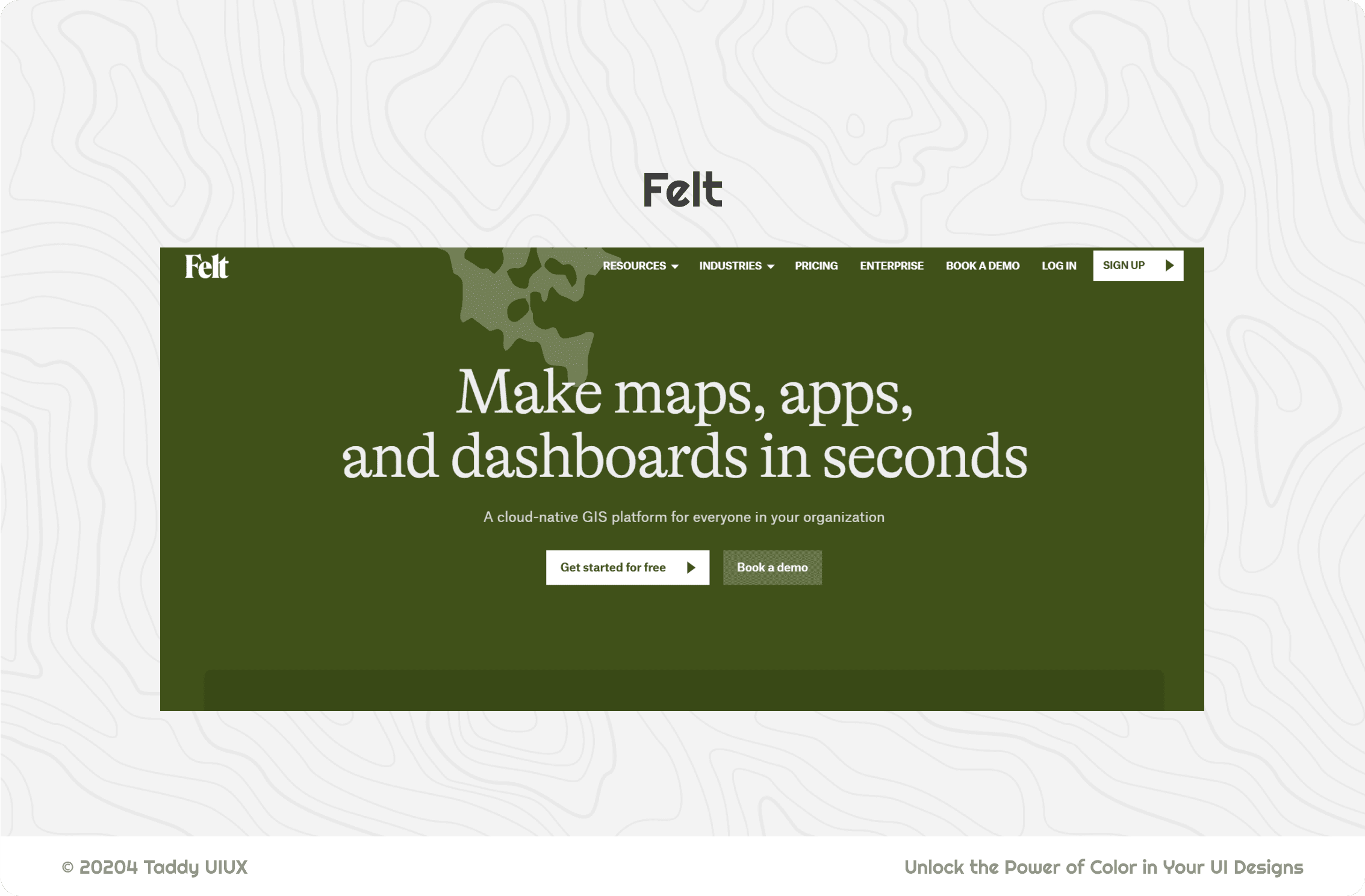
C. Green:
Want to signal growth, health, or positive vibes? Green is the color of nature, balance, and "go!" Think of the fresh, vibrant green of Whole Foods Market, instantly connecting you to healthy choices. Or the green checkmark that signals success in so many apps – that satisfying feeling of accomplishment.
Environmentally conscious brands, and even some financial institutions aiming for a sense of prosperity, often leverage green's positive associations.
D. Yellow:
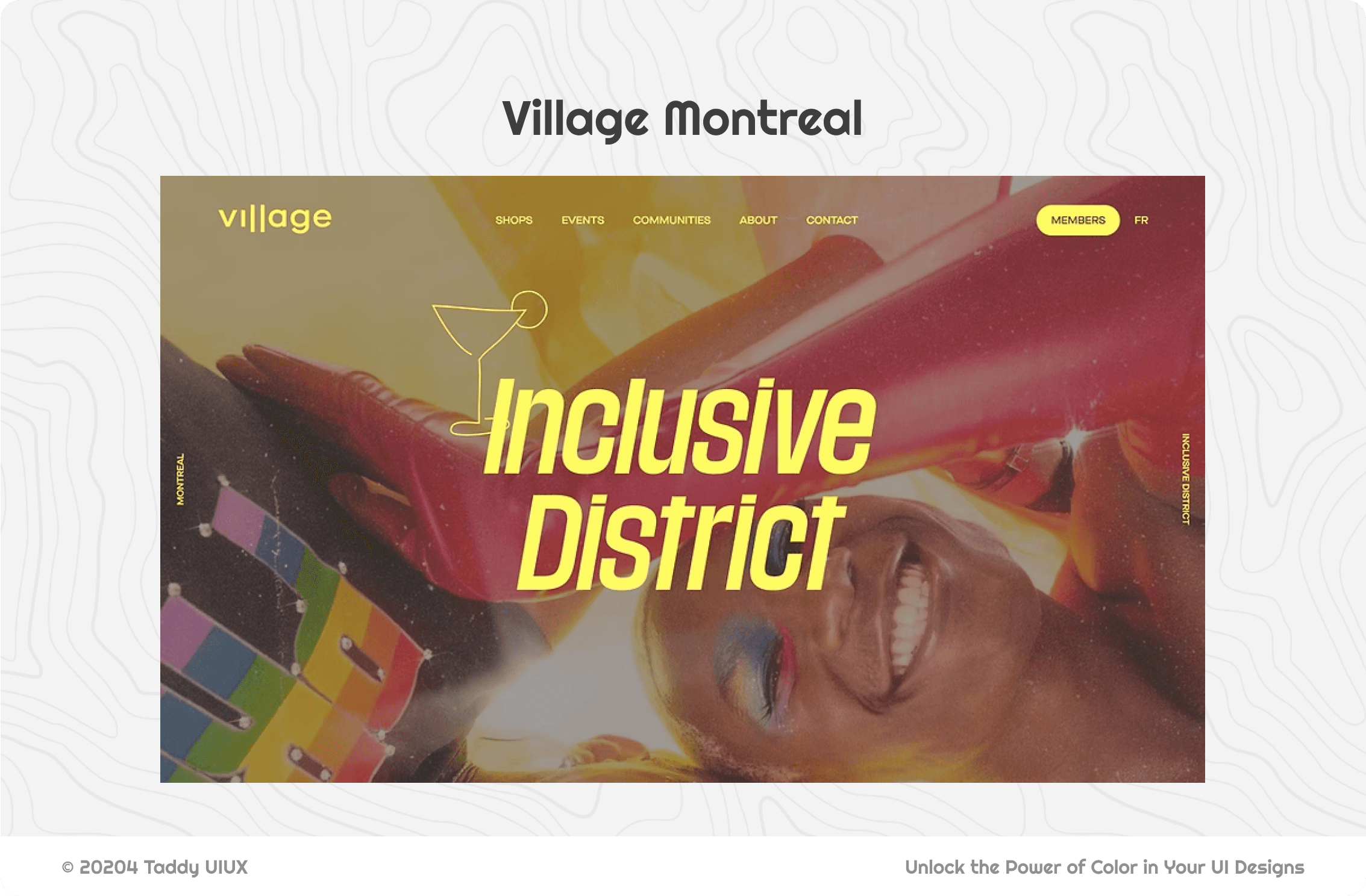
Looking to add a pop of sunshine and optimism? Yellow is bright, cheerful, and undeniably attention-grabbing. But be warned: too much yellow can quickly become irritating, like a constant, high-pitched alarm.
That's why it's often used as an accent color – think of the iconic Snapchat logo or the eye-catching price tags at Best Buy. It's perfect for adding a touch of youthful energy, but use it with care.

E. Orange:
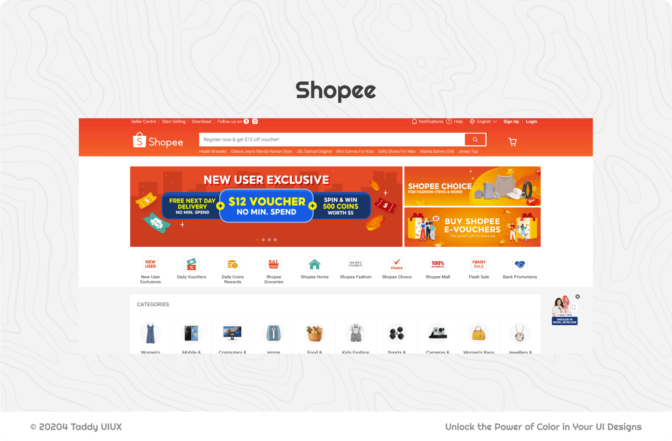
Are you hungry looking at websites with a lot of orange? That's no accident! Orange blends the energy of red with the friendliness of yellow, creating a feeling of enthusiasm, creativity, and affordability.
It's a popular choice for e-commerce, especially for calls to action – think of Amazon's "Add to Cart" button, practically begging you to click. Nickelodeon uses orange to project a playful, kid-friendly vibe. It's the color of cheerful action.
F. Purple:
Want to evoke luxury, royalty, or a touch of mystery? Purple is the color of sophistication and creativity. Think of the rich purple of Cadbury chocolate, instantly conveying a sense of indulgence. Or the regal feel of the Hallmark logo.
Brands aiming for a high-end image, or those in the creative or spiritual fields, often use purple to create a sense of exclusivity and wisdom.

G. Black and White:
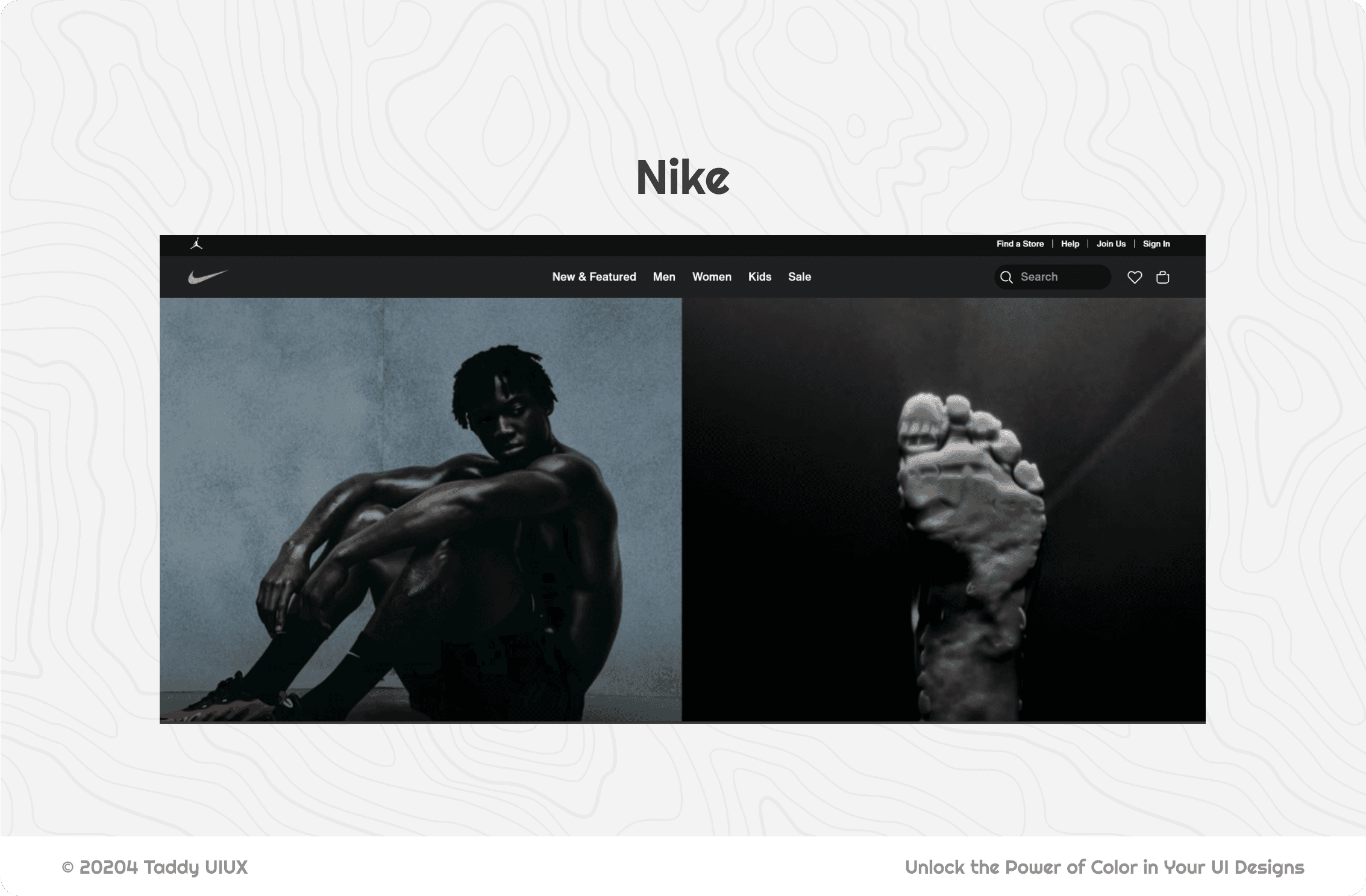
Seeking timeless elegance and understated power? Black and white offer the ultimate in contrast and sophistication. Black exudes power, formality, and a touch of mystery, perfect for luxury brands or those wanting a minimalist aesthetic. White conveys purity, cleanliness, and modernity, creating a sense of spaciousness and clarity.
Together, they form a classic combination favored by high-end fashion houses like Chanel, technology giants like Apple, and sports brands like Nike and Adidas, representing quality, precision, and enduring style

Creating Effective UI Color Palettes
So, you've got a handle on color psychology and how brands use different hues. You've seen how contrast can make or break your designs. Now, let's get practical! We're going to dive into some helpful guidelines – think of them as "training wheels" for creating balanced and effective color schemes. But remember, rules are made to be understood, and then maybe strategically broken.
A. The 60-30-10 Rule:
Ever feel overwhelmed by the sheer number of color choices? The 60-30-10 rule is like a magic formula for creating visually pleasing palettes without pulling your hair out. It's not law, but it's a fantastic starting point:
60% Dominant Color: This is your foundation, your workhorse. Think of it as the backdrop for your design – often a neutral (gray, white, beige) or a very muted version of your brand's primary color. It sets the overall tone.
30% Secondary Color: This color plays a supporting role, adding visual interest and complementing your dominant color. It's usually a bit bolder, but still harmonious.
10% Accent Color: Pop! This is your attention-grabber. Use it sparingly for key elements like buttons, calls to action, or important notifications. Think of it as the "spice" in your color recipe.
B. Choosing Your Base Color:
Picking that 60% dominant color is a big decision. It's like choosing the foundation for a house – it sets the stage for everything else. Ask yourself these crucial questions:
Brand Vibes: Does this color feel like your brand? Does it align with your personality and values? A luxury brand probably wouldn't choose a neon green base (unless they're really going for edgy!).
Who Are You Talking To?: What colors will resonate with your target audience? Consider their demographics, preferences, and cultural associations.
Setting the Mood: What overall feeling do you want to create? Warm and inviting? Cool and professional? Neutral and minimalist? Your base color is a major mood-setter.
C. Building Your Palette:
These are tried-and-true methods for creating color combinations that just work.
Shades and Tints: Your Secret Weapon: Don't feel like you need to introduce a whole rainbow of new hues. Playing with lighter tints (adding white) and darker shades (adding black) of your base and secondary colors can create depth and variation without sacrificing visual cohesion. It's like having a whole palette within a single color!
Don't Be a Scaredy-Cat: Seriously, experiment! Use online color palette generators (we'll link to some awesome ones later) to explore different combinations and see what sparks joy. You might stumble upon something unexpectedly amazing.
D. Contrast is King (and Queen!):
We've talked about this before, but it bears repeating: sufficient contrast between text and background is non-negotiable. It's not just about looking good; it's about making your designs usable and accessible to everyone. If people can't read your text, your beautiful color palette is pointless.
E. Color Blindness Considerations:
Here's a sobering statistic: a significant chunk of the population (around 8% of men and 0.5% of women) has some form of color blindness. That means relying solely on color to convey information is a big no-no.
Don't Just Use Color: Always, always use text labels, icons, patterns, or other visual cues in addition to color. Think of color as a bonus, not the primary communicator.
Simulate, Simulate, Simulate: Use color blindness simulator tools (I'll hook you up with some links!) to see how your designs might appear to people with different types of color vision deficiencies. It's an eye-opening experience (pun intended!).
Tools and Resources
Okay, you've got the theory down. Now it's time to get your hands dirty! These tools will be your trusty sidekicks, helping you create, test, and find inspiration for killer UI color palettes. No more staring blankly at a color wheel – let's get to work!
A. Color Palette Generators:
Coolors (coolors.co): Feeling lucky? Hit the spacebar and watch Coolors generate palettes like magic. Lock colors you love, and tweak the rest. It's fast, fun, and addictive.
Adobe Color (color.adobe.com): The powerhouse. Create palettes based on color harmonies, extract colors from images (super handy!), and explore trending palettes. Basically, it's a color playground.
Paletton: Your color theory tutor. This tool helps you build palettes based on classic color relationships (complementary, analogous, etc.). Think of it as training wheels for harmonious color schemes.
Colormind: Let the robots do the work! Colormind uses deep learning to generate palettes from scratch or based on an image. It's like having a color-savvy AI assistant.
Muzli Colors: Your all-in-one color command center. Palettes, inspiration, and more – it's got you covered.
B. Contrast Checkers:
Contrast Ratio: Simple, fast, and effective. Get a quick contrast ratio check without any fuss.
WebAIM Contrast Checker: The gold standard. This tool checks your color combinations against WCAG guidelines, ensuring your designs are accessible to everyone. No excuses for unreadable text!
Accessible Colors: Not sure what colors will work? This tool suggests accessible combinations, taking the guesswork out of the equation.
C. Color Blindness Simulators:
Color Oracle: A free, powerful simulator for Windows, Mac, and Linux. Get a realistic preview of how your colors are perceived by people with various types of color vision deficiencies.
Coblis: Step into the shoes of someone with color blindness. This web-based simulator shows you how your designs might appear to different users.
D. Inspiration Sites:
Behance: Another treasure trove of UI/UX projects. Dive deep and discover how other designers are using color effectively.
Dribbble: Get inspired by top designers! Search for "UI color palettes" or browse specific design categories to see what's trending and spark new ideas.
Awwwards: Check out award-winning websites for some serious color inspiration. See how the best of the best are pushing the boundaries.
UI Movement: A curated collection of UI design goodness. Your daily dose of color (and animation!) inspiration.
Comments
No more delays.
Drop your details, and let's focus on crafting the best product possible.
Best UI/UX Solutions,
Best Business Results.

© 20204 Taddy UIUX
Contact
(+84) 0906731543
taddy.uiux@gmail.com